Clear Segmented Picker
Building a transparent, glassy segmented control for iOS — because the native one just isn't good enough.

25th February 2026
A segmented picker is one of those UI components that sounds trivially simple until you actually try to ship a polished version of it. At its core, it's just a row of options where exactly one is selected — but the way it looks and feels communicates a lot about the quality of your app. A sluggish animation, a jarring selection indicator, or labels that truncate unexpectedly can quietly erode trust in an interface that otherwise feels tight. In that sense, the segmented picker is a small thing that carries a disproportionate amount of weight.
With iOS 26, Apple introduced the liquid glass design language — a sweeping visual refresh that brought depth, translucency, and motion to native components across the entire system. The new liquid glass styled Picker (given a segmentedPicker style) looks genuinely beautiful in screenshots. It has that frosted, layered quality that feels at home in the new OS aesthetic. But once you actually try to use it in a real product, the cracks show fast. The most glaring issue: it assumes every segment is the same width. If you're building something with labels of varying lengths — say, "all", "unread", and "needs attention" — the component either forces awkward uniform widths or behaves unpredictably. Beyond that, there's very little room to customise the selection indicator's shape, colour, or spring behaviour. For any app that has its own visual identity, the native component quickly becomes more of an obstacle than a starting point.
This is a problem I ran into while building a few features at Fold. The app needed a segmented control that could sit on top of variable backgrounds, adapt to different label lengths naturally, and animate with a spring that felt snappy but not mechanical. The native control couldn't do any of that without significant workarounds, so I built one from scratch — a clear, floating indicator that slides between options with a spring, sits on any background, and respects whatever label widths the content naturally produces.
After shipping that in Fold, I thought this could be a bit better - be more colorful and playful, enriched with SF Symbols. I'm working on Felix and wanted to bring a similar picker UI. So I tweaked the segmented picker a bit so that the geometry is cleaner, and so that the picker takes in richer colors / icons (or even lotties) and furnished it with a vibrant look.
How it's built
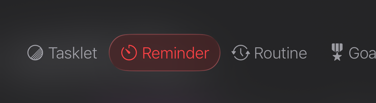
Let's break down the interesting stuff - see what's happening underneath this interface. FYI: this component was heavily inspired by the picker that's shown when you tap on a contact within iMessage, the one with "Info", "Backgrounds", "Photos" etc.
The interface
The component takes three things: the tab labels, optional SF Symbol icon names, optional per-tab tint colours, and a binding to the currently selected index. Keeping the interface this lean means it drops into any screen without ceremony. (You can also extend this to support lotties or custom views instead of just text)
public struct ClearSegmentedPicker: View {
    public let tabs: [String]
    public let icons: [String]?
    public let colors: [Color]?
    @Binding var currentTab: Int

    public init(
        tabs: [String],
        icons: [String]? = nil,
        colors: [Color]? = nil,
        currentTab: Binding<Int>
    ) {
        self.tabs = tabs
        self.icons = icons
        self.colors = colors
        self._currentTab = currentTab
    }
}
The icons and colors arrays are both optional and positionally matched to tabs — index 0 of icons maps to index 0 of tabs, and so on. If you don't pass them, the picker renders with just text and a neutral indicator. The binding is the only piece of external state the caller has to own.
Measuring widths with PreferenceKeys
One challenging aspect was getting the indicator to be exactly as wide as the label it's sitting under — not the full tab cell, just the text content. SwiftUI doesn't give you geometry for free; you have to ask for it using PreferenceKey.
The idea is that each label uses a GeometryReader to measure its own rendered size and bubbles that value up through the preference system. The parent view collects all those measurements via onPreferenceChange and stores them in state.
struct TextWidthPreferenceKey: PreferenceKey {
    static var defaultValue: [Int: CGFloat] = [:]
    static func reduce(value: inout [Int: CGFloat], nextValue: () -> [Int: CGFloat]) {
        value.merge(nextValue(), uniquingKeysWith: { $1 })
    }
}

struct TabWidthPreferenceKey: PreferenceKey {
    static var defaultValue: [Int: CGFloat] = [:]
    static func reduce(value: inout [Int: CGFloat], nextValue: () -> [Int: CGFloat]) {
        value.merge(nextValue(), uniquingKeysWith: { $1 })
    }
}
You end up with two arrays in state: tabWidths (the full clickable cell width for each tab) and textWidths (just the rendered label width). The indicator uses textWidths[currentTab] for its frame width, and uses tabWidths to compute how far to offset from the leading edge. This is what makes the indicator snug around the label rather than spanning the full cell.
Three layers in a ZStack
This is perhaps the most important detail of how I was able to achieve building the component: The visual structure is a ZStack with three distinct layers, each with a specific job:
- Layer 0 — the indicator: the sliding glass pill. It reads
currentTabanddragOffsetto position itself, animates with a spring, and sits behind everything else so it never blocks taps. - Layer 1 — the labels: the
HStackof text (and optional icons). These are interactive — each one has anonTapGesturethat updatescurrentTab. They sit above the indicator so they receive taps normally. - Layer 2 — the drag overlay: an invisible
Color.clearrectangle, sized and positioned exactly over the current indicator. Its only job is to capture drag gestures. Placing it on its own layer at the highestzIndexmeans drags are never accidentally swallowed by the label hit targets underneath.
Separating tap handling (labels) from drag handling (overlay) is what makes both feel reliable. If you try to handle both in the same gesture, you end up fighting SwiftUI's gesture priority system. This was a huge win - because I was not able to achieve this with just 1 or 2 layers.
The drag gesture
The drag gesture lives on that invisible overlay. While dragging, dragOffset tracks the raw translation and the indicator follows in real time via calculateIndicatorOffset(). The offset is clamped so the indicator can't escape the bounds of the picker.
DragGesture(minimumDistance: 0)
    .onChanged { gesture in
        isDragging = true
        dragOffset = gesture.translation.width
    }
    .onEnded { gesture in
        isDragging = false
        snapToNearestTab(dragDistance: gesture.translation.width)
        dragOffset = 0
        UISelectionFeedbackGenerator().selectionChanged()
    }
On release, snapToNearestTab walks the tab centers to find which one the indicator landed closest to, then springs to it. The haptic fires on both tap and drag-release — a small detail that makes the selection feel physical.
Bonus: scroll-synced tabs with ScrollViewReader
Where this gets really useful is pairing it with a ScrollViewReader. If each tab's content is a view with a stable ID, you can scroll programmatically when the tab changes — and update the picker when the scroll position changes.
ScrollViewReader { proxy in
    ClearSegmentedPicker(tabs: tabs, currentTab: $currentTab)
        .onChange(of: currentTab) { _, newTab in
            withAnimation(.spring(response: 0.3, dampingFraction: 0.7)) {
                proxy.scrollTo(tabs[newTab], anchor: .center)
            }
        }

    ScrollView(.horizontal, showsIndicators: false) {
        HStack {
            ForEach(tabs.indices, id: \.self) { index in
                ContentView(for: index)
                    .id(tabs[index])
            }
        }
    }
}
The picker drives the scroll, and you can wire the reverse direction too — update currentTab from a scroll offset — to get the full two-way sync. At that point you have a horizontally paged layout with a synced indicator that feels native to iOS without actually using anything native.